DRAGPLAYPAUSEENTERFLIP IT!
Scroll
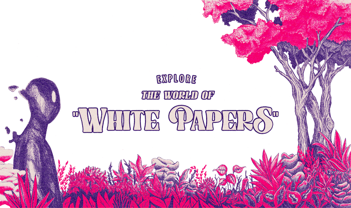

Created to be shared ❊
Created to be shared ❊
Created to be shared ❊
Created to be shared ❊
Created to be shared ❊
Scroll
Christofle
Client
Christofle
Date
2020
Role
Art Direction
Conception
UI & UX Design
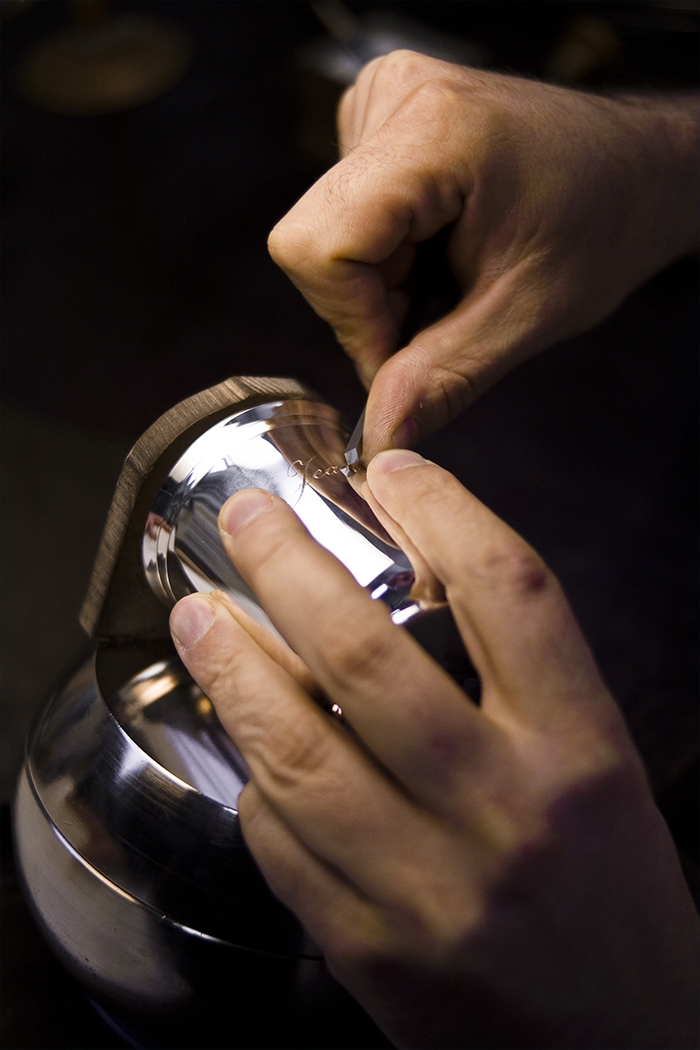
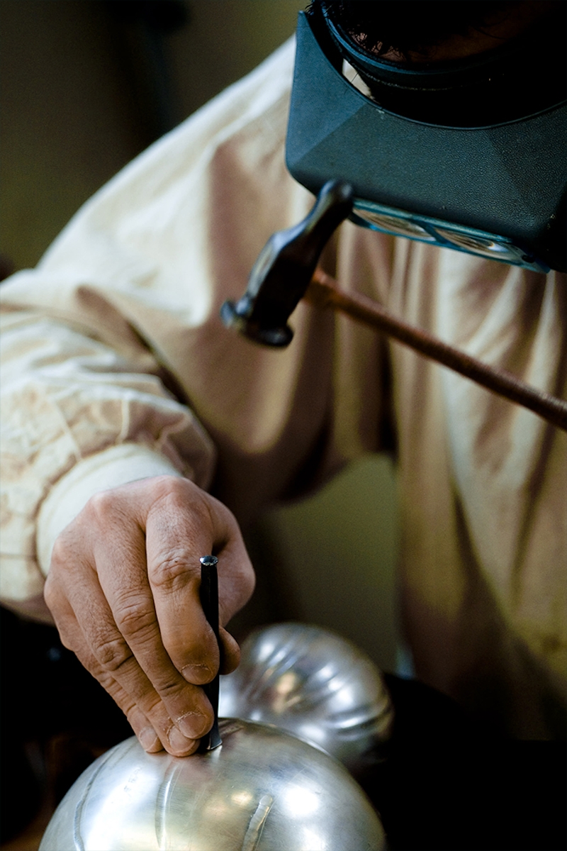
The Art of Living is indeed an Art: inventing a universe, taking pleasure in decorating a house, setting a table, sharing the good and the beautiful, cultivating the happiness of each moment. Since 1830, Christofle has been creating, with elegance and know-how, exceptional table art, refined jewelry and home accessories.
theDes-
ign
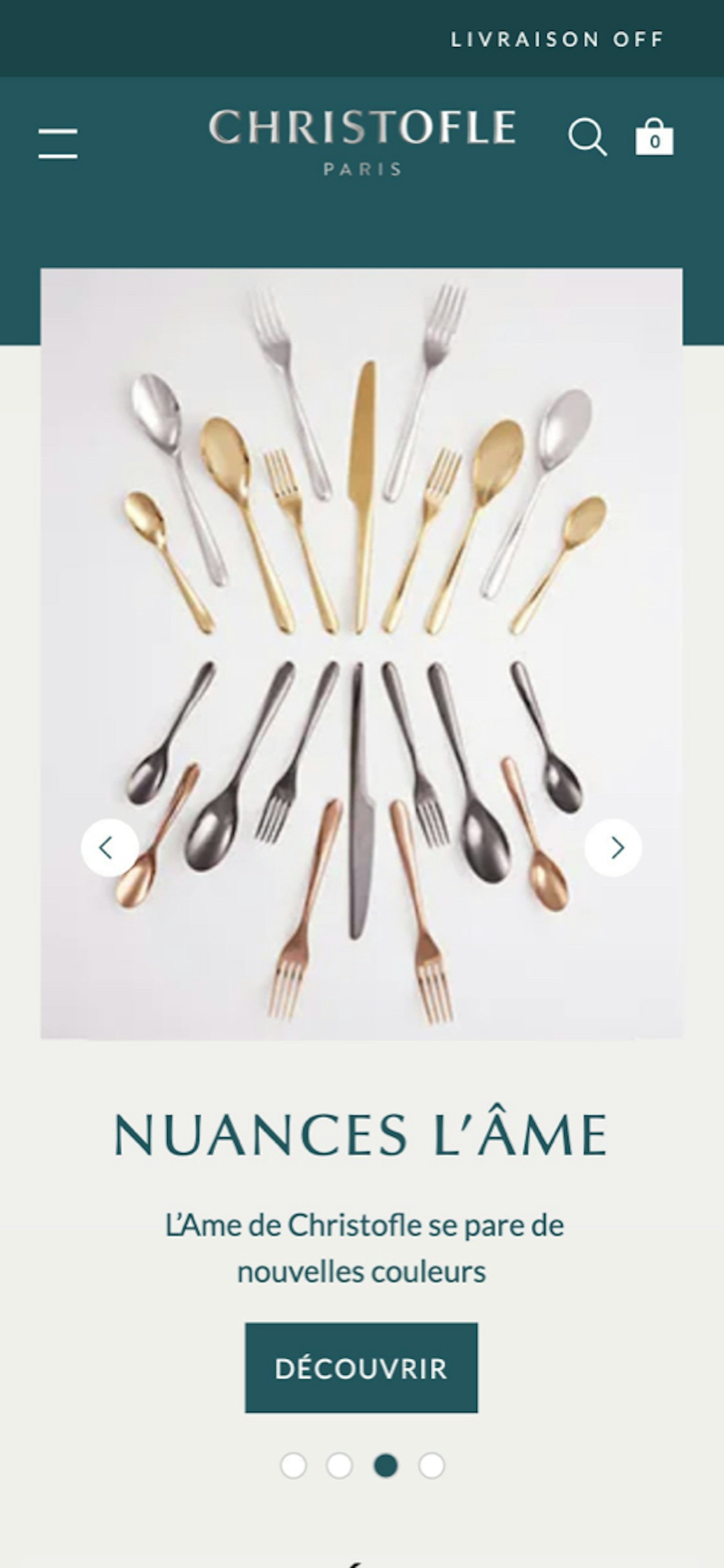
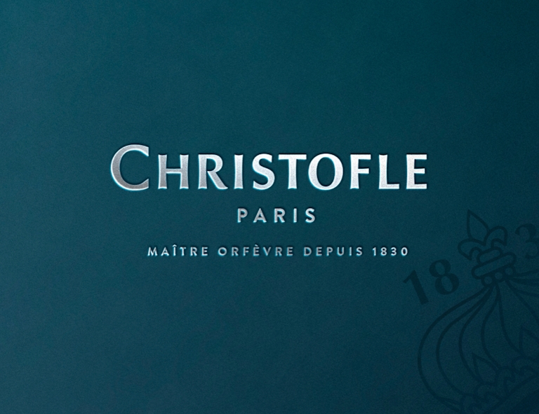
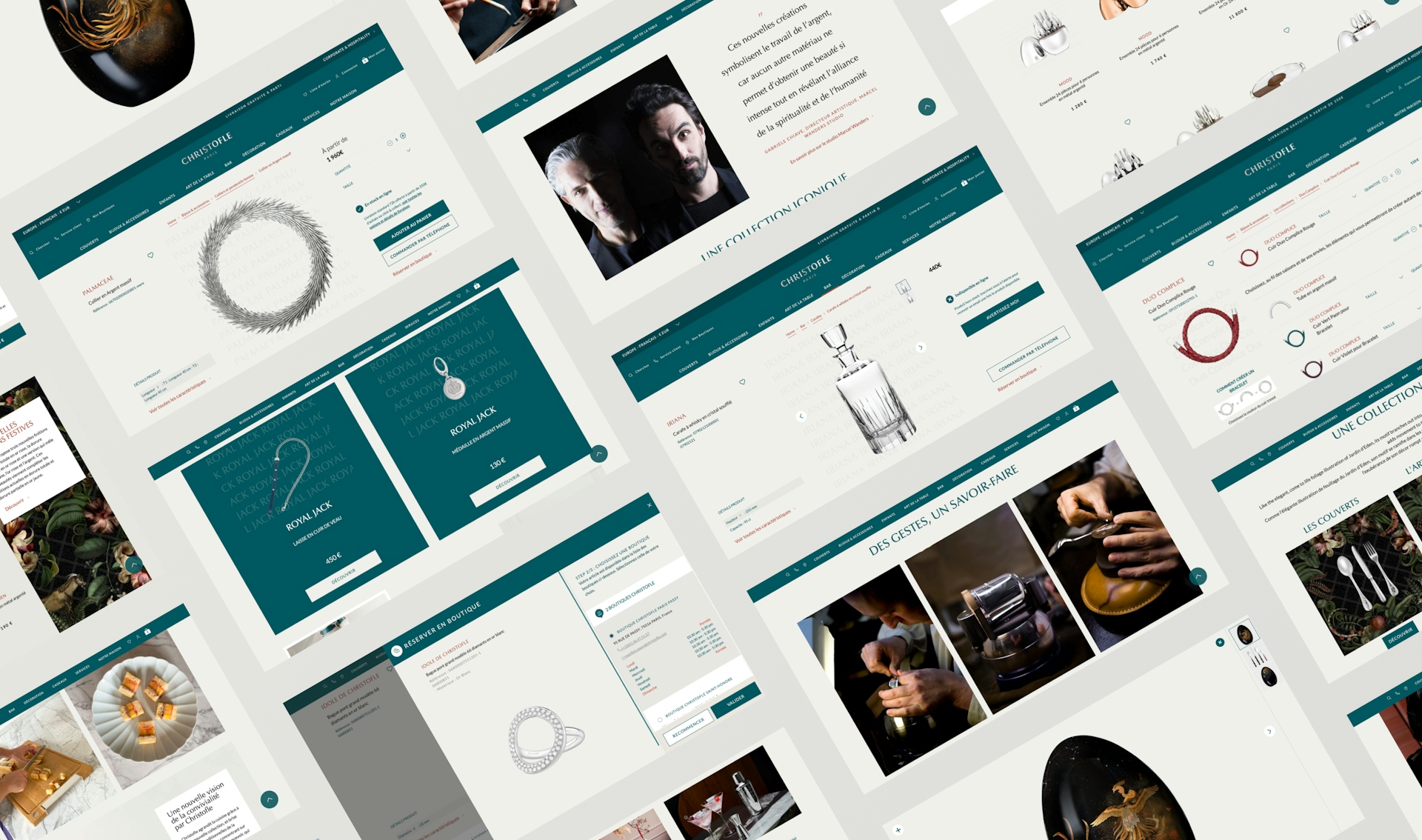
The Identity
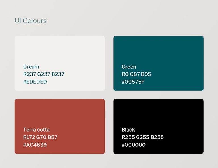
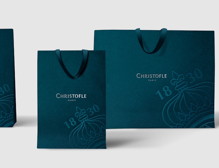
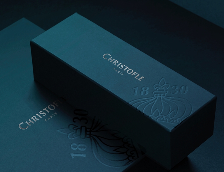
Christofle’s renewal is part of a larger transformation of the brand’s image. The first part of the process was undertaken by BETC Design who worked on the identity: overhaul of the logo and blazon, and creation of a colour identity: “peacock green”.
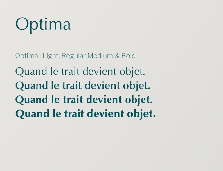
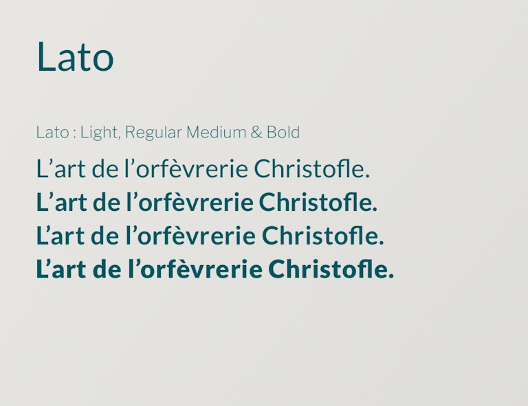
It was then our turn to enrich those new elements and apply them to their digital assets. We chose the Optima font for its similarities with the logo and created a colour, “terracotta”, to prioritize information. Finally, we created an interface combining the codes usually used in the luxury sector, web standards and new norms of accessibility.
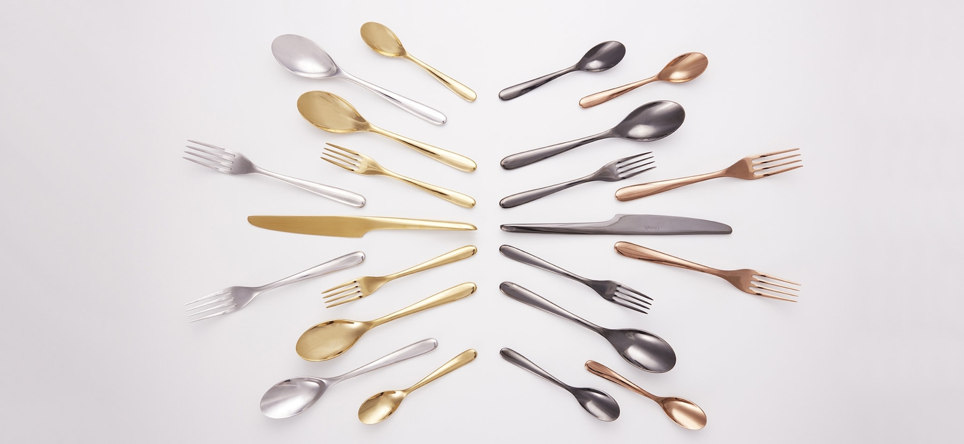
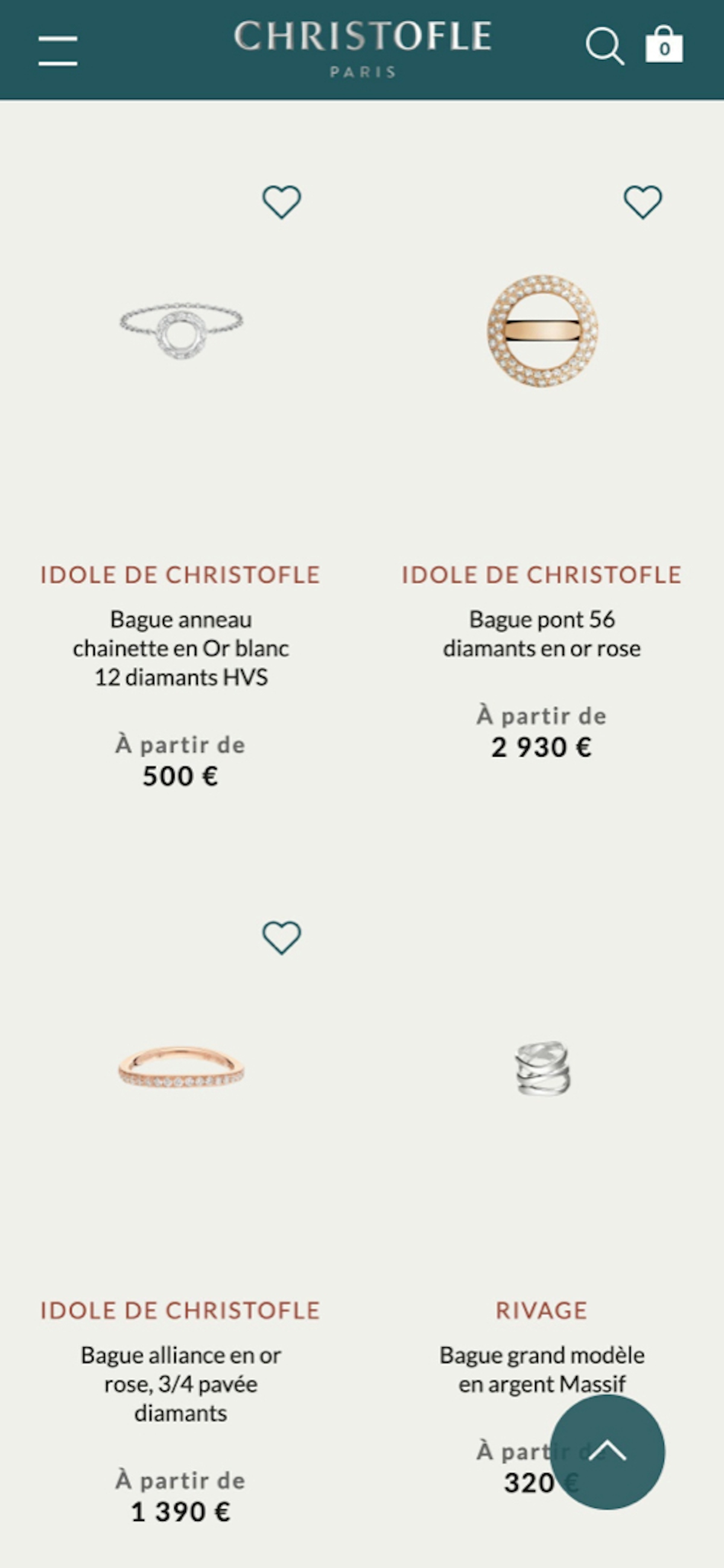
The Catalog
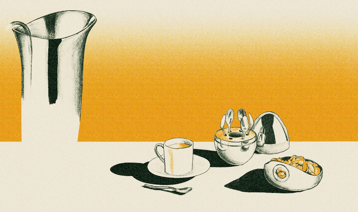
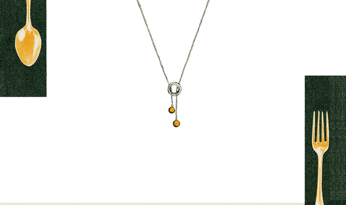
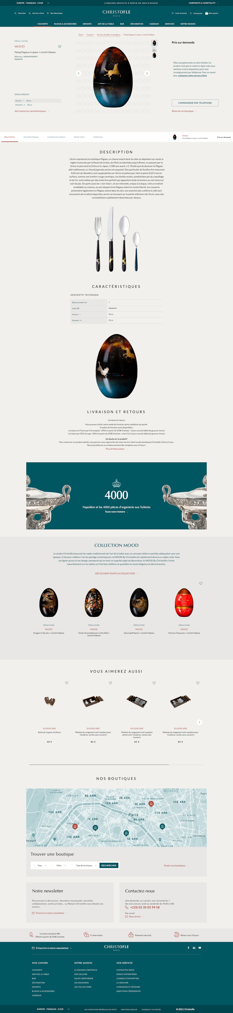
The website regroups 3,500 pieces including forks, spoons or even earrings. In order to emphasize the majesty of the silverware we chose to complete our graphic chart with a cream colour for the backgrounds. Finally, each product picture had to be studied and rethought to bring the best out of it. Our objective was to create uniformity through clear guidelines for the shooting of the new catalog.


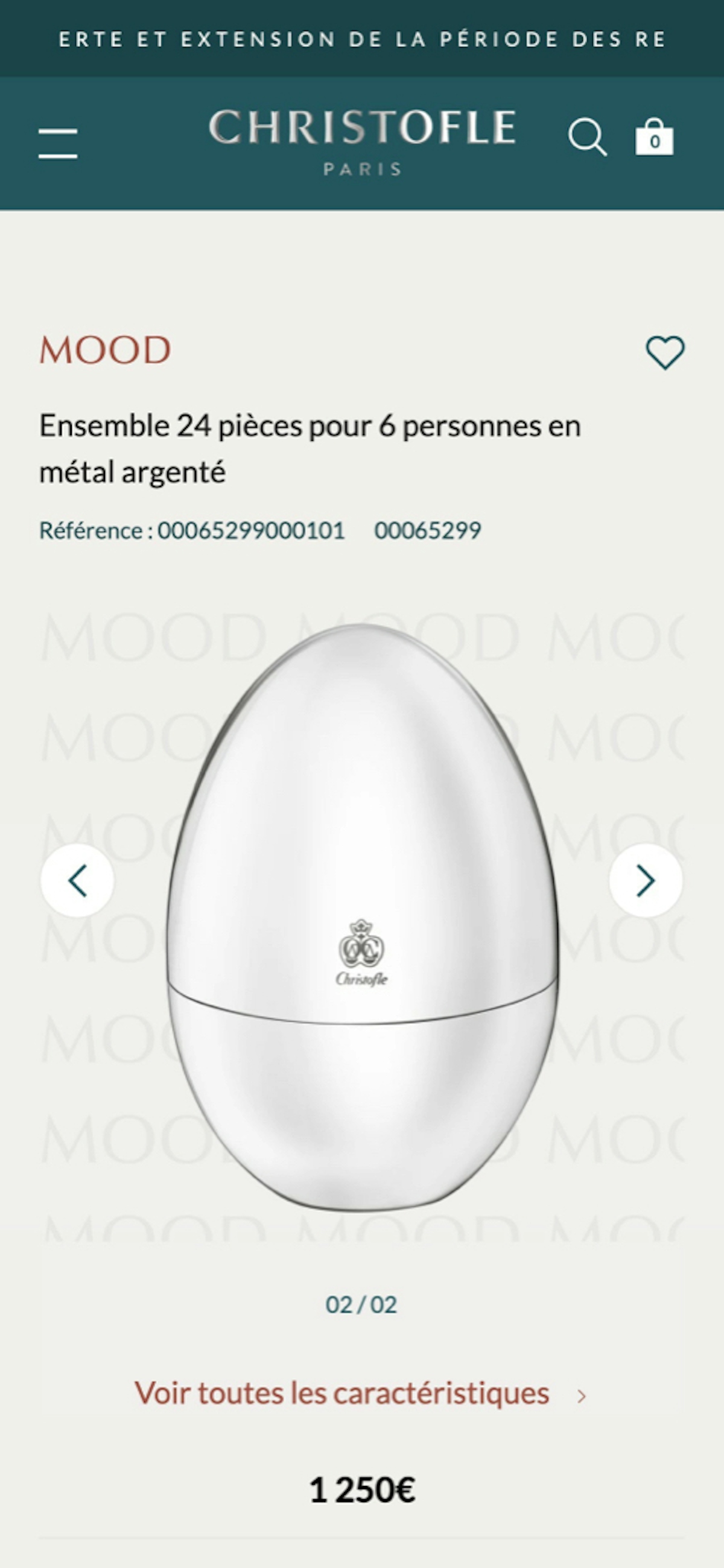
The Product page
The product page was the main challenge for this website. This key element had to present and magnify the different characteristics of each item. We then had to apply it to the whole catalog. Every part has been designed as windows you can activate or deactivate depending on the amount of information.
The E-Commerce Experience
In order to offer a unique experience we decided to design personalized routes. Every customer will therefore discover different contents depending on their profile. A new potential customer using the website for the first time will not be presented with the same elements as another client or a person who just bought an item.
Credits
Studio
Le Studio Digital
DIGITAL
PRODUCER
PRODUCER
Jean Delpech
EXECUTIVE
DIGITAL PRODUCER
DIGITAL PRODUCER
Margaux Pennes
DESIGN
LEAD
LEAD
Pascal Fauveaux
ART
DIRECTOR
DIRECTOR
Quentin Goupille
UX
DESIGNER
DESIGNER
Léo Cabannes
LEAD
DEV
DEV
DS Agency
ALL PHOTOS AND DOCUMENTARY MATERIALS USED IN THIS PROJECT ARE BELONG TO THEIR OWNERS.
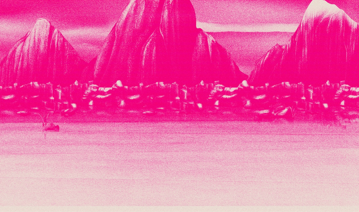
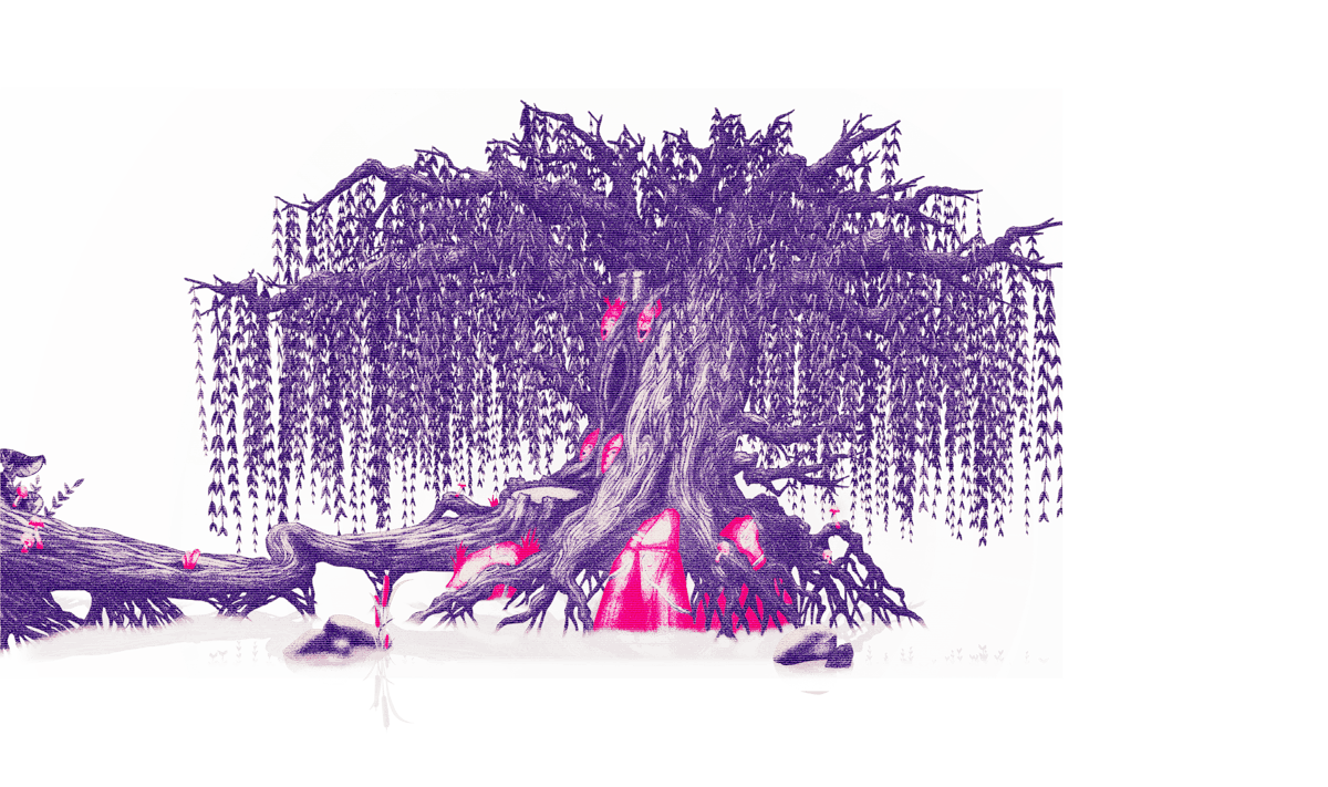
Fragments of my imagination ✣
Fragments of my imagination ✣
Fragments of my imagination ✣
Fragments of my imagination ✣
Fragments of my imagination ✣
Quentin Goupille
Art Director
Illustrator
Quentin Goupille
Art Director
Illustrator
Quentin Goupille